Product Navigation Redesign
Project summary
Audited navigation across Intuit products, defined a standardized approach for consistent wayfinding, and led the ProConnect rollout which resulted in a modernized layout with a new first-time use experience.
- 2Components launched
- 12Refreshed icons
- NewFirst-time use experience
Problem
Disparate navigation patterns weakened brand recognition and consistency.
Across Intuit products, navigation followed a few recurring patterns, but nothing lived in the design system as a component teams could adopt, theme, and maintain. Each product still built its own version, so similar experiences slowly diverged in behavior and styling.
The Intuit Design System team took on packaging those recurring patterns into unified components with clear specs that teams could actually adopt.
Discovery
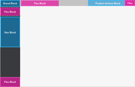
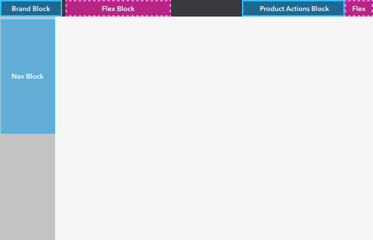
A cross-product audit mapped two layout hierarchies.
We started by cataloguing what was already in the wild. Two patterns showed up again and again:
- Left nav dominant (LND) — the sidebar owns the shell; brand and navigation stack vertically on the left.
- Product header dominant (PHD) — the header bar leads; the left rail is secondary.
Even within those categories, behavior diverged quickly:
- Layout hierarchy. Some products treated the left nav as dominant, stacking it over the header; others led with the header instead.
- Interaction patterns. Teams used flyouts, accordions, or a mix of both.
- Collapse behavior. Some products let users collapse the left nav; others did not.
Ownership added another layer of complexity. Different non-product teams controlled different parts of the navigation experience, which meant any single product refresh could only standardize so much at once.
Approach
Per-product pressure tests and interactive prototypes drove the standard.
The audit gave us a shared vocabulary. From there, we pressure-tested treatments product by product, looking for what fit each customer experience without drifting from brand guidelines.
My contribution was turning those tests into an interactive prototype. Stakeholders could react to real layout and interaction changes instead of static comps, which shortened the loop to an approved solution.
What shipped
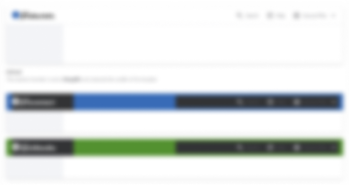
Left navigation and product header, fully themed.
We delivered left navigation and product header as two design components, each with specs product teams could build from directly. Those specs covered layout, interaction, and styling, and included recommendations for a unified standard grounded in what we found during the audit.
That let teams ship immediately with their existing implementations and migrate to the recommended standard when they were ready. The design system team did not have engineering bandwidth to build the coded components centrally, so adoption depended on product teams implementing from the specs themselves.
Partnerships
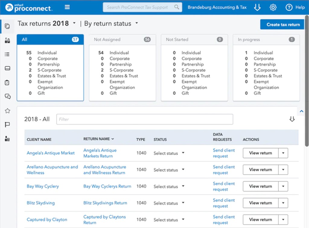
ProConnect was where the standard met real product constraints.
ProConnect was the first major rollout, and product teams were implementing the components themselves. I stayed embedded with the design team to adapt the shared patterns to their context, then ran customer user-testing to validate the layout before getting it prioritized for engineering.
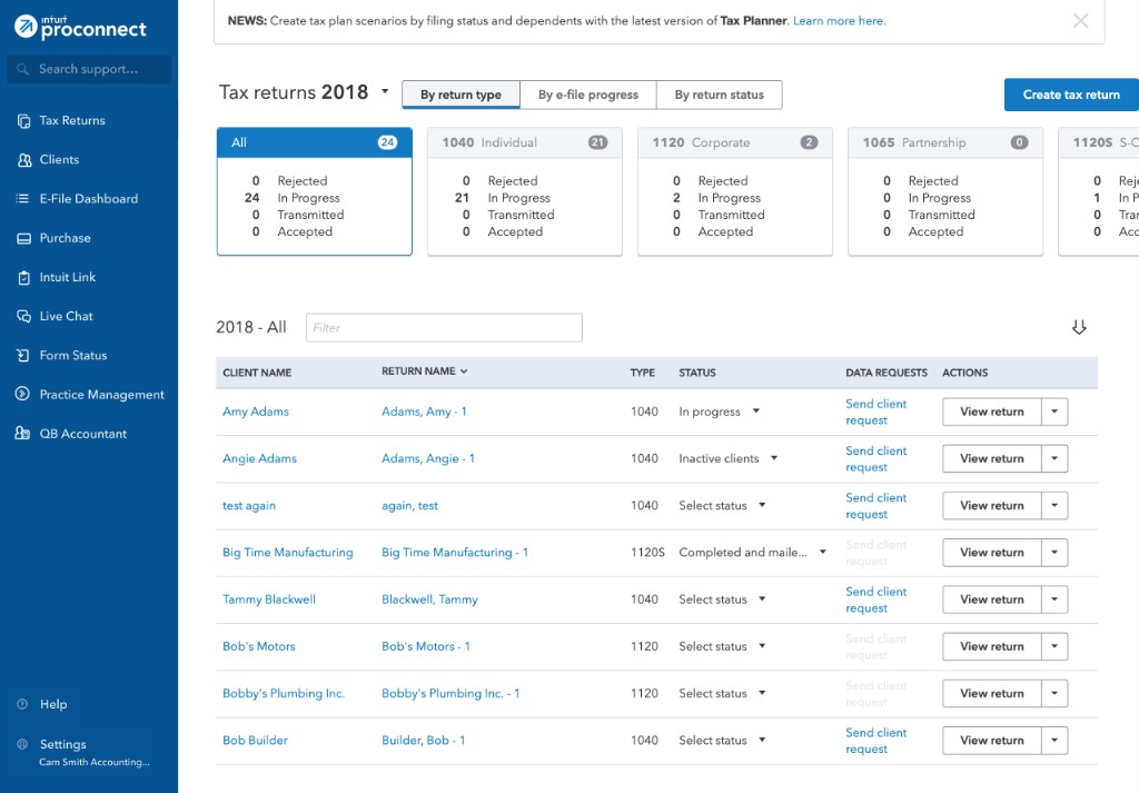
Feedback confirmed we were addressing the right pain points:
- Workspace. Users loved the added real estate in the main content section.
- Visual polish. The refreshed icon set felt more cohesive and professional.
One accountant told us he liked moving items from the header into the left nav because it gave him more workspace for data-entry work.
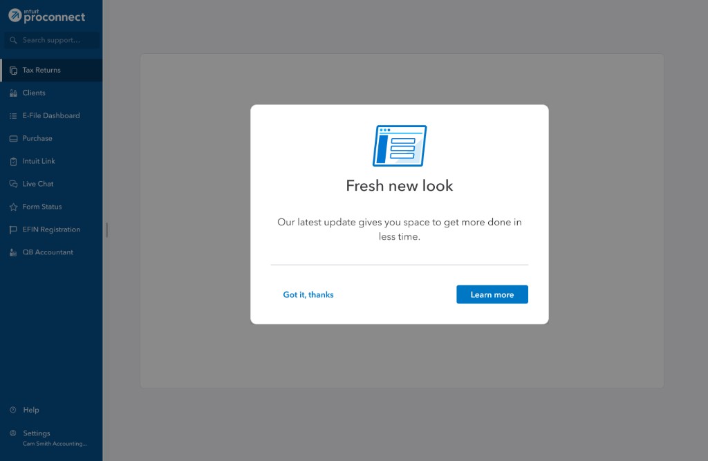
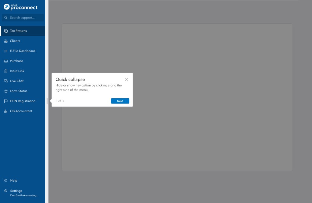
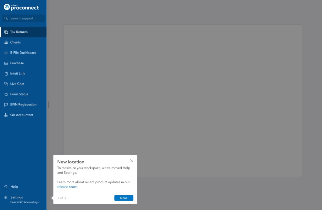
Existing customers would still feel the layout change immediately, so I worked with a content designer on a first-time use experience to orient them in the new structure. The flow opened with a welcome modal, then walked customers through collapse behavior and the new Help and Settings locations.
Through implementation, I stayed paired with ProConnect engineering to close spec gaps and keep delivery moving.
Takeaways
What I learned, and what I'd carry forward.
Learnings
- Roadmap constraints and dependencies across non-product teams are critical when defining impact and success metrics.
- Teams can worry they are losing product identity when adopting consolidated design patterns.
- I would spend less time on supporting legacy patterns and more time on building for the new standards.
What I’d carry forward
- Interactive prototypes are a powerful tool for getting buy-in and iterating on designs.
- Design and engineering partnerships are key to improving adoption of design system components.
- Building flexibility into design patterns helps teams customize the experience for their customers.
Interactive demo
Explore the navigation pattern in practice.
This demo uses a simplified product shell to show the navigation pattern. A few design choices here reflect updates based on customer and team feedback.
How to explore
Keyboard navigation. Tab into the demo to reveal Skip to content, then move through the sidebar with Tab.
Collapse the nav. Choose Collapse at the bottom of the sidebar.
Hover for labels. With the nav collapsed, hover an icon to see its flyout label.
Open search. Click Search in the sidebar, or use the keyboard shortcut shown in the search bar.
Resize the demo. Drag the handle below the frame, or focus it and use the arrow keys. Home and End reset the height.